
Guide / design and UI
Inventory management system design and UI, judged honestly
A good inventory UI is measured in seconds to answer and keystrokes to record — not screens. What the well-designed screens have in common, whether you are buying or building.
The key facts
- The UI question that decides everything: how many seconds from "do we have 40 of these?" to a trusted answer — and how many clicks to record a movement?
- The core screens: a list with live quantities, a reorder view, a count screen, an order flow. Everything else is commentary.
- Design for the worst operator: warehouse gloves, a phone screen, Friday afternoon — not the demo room.
- Building your own? The same principles apply; the record design matters more than the pixels. What an inventory system does is the syllabus.
- 01The key facts
- 02What the screens must answer instantly
- 03Design principles that survive contact with a warehouse
- 04If you are designing or building your own system
What the screens must answer instantly
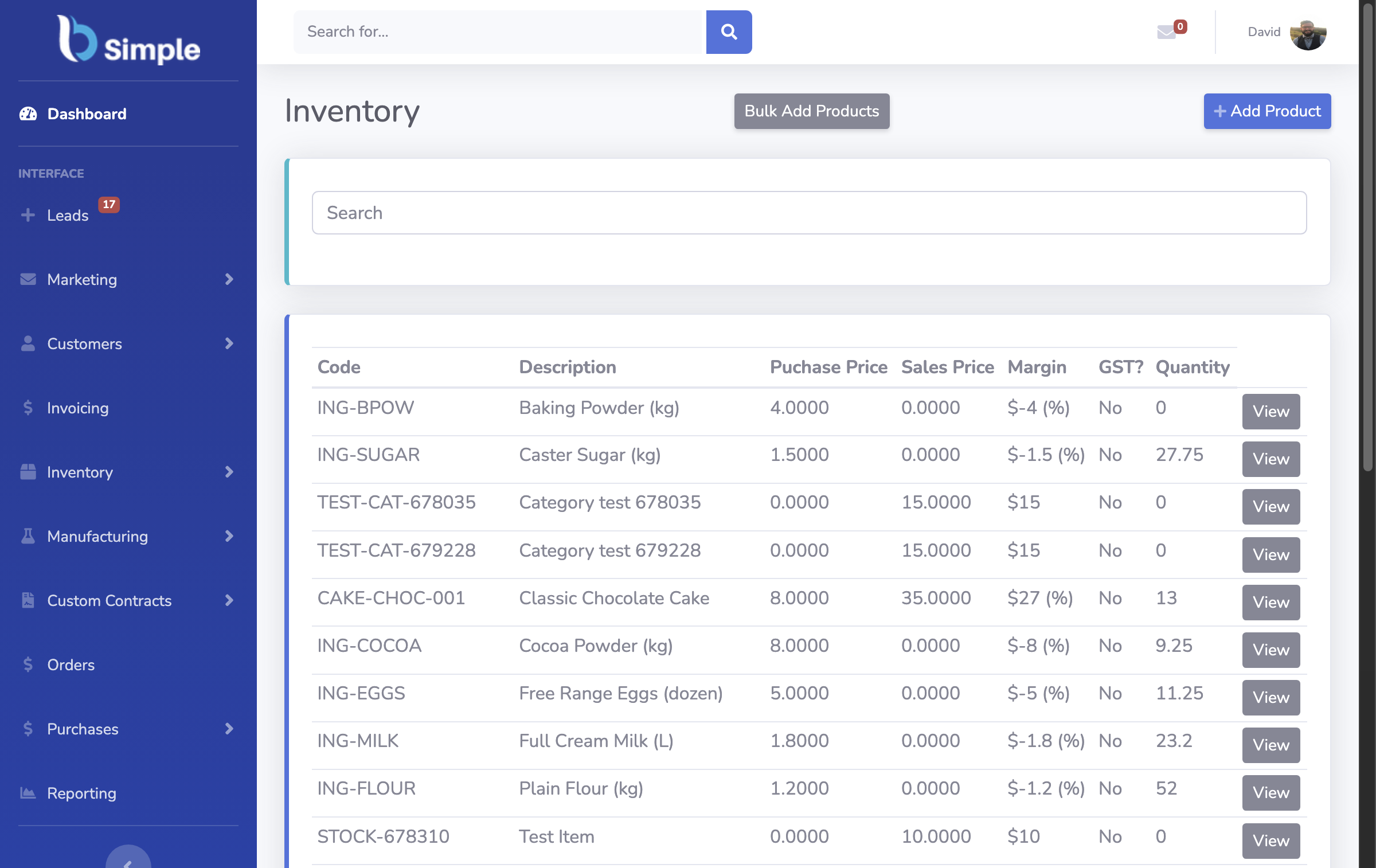
Every inventory UI lives or dies on four questions, and each needs a screen that answers it without a report, an export or a phone call: what do we have (a product list showing live quantities per location — not a month-end figure), what needs buying (a reorder view working from par levels against current stock, not a spreadsheet you rebuild weekly), what counts as true (a stocktake screen where counts, variances and adjustments are one flow), and what is happening to it (orders moving through pick, pack and invoice against the same quantities).
If a demo cannot answer all four from the main navigation in under a minute, the design is hiding the work. BSimple's own screens — the operations dashboard with order, invoice and stock values, the reorder view, the stocktake flow — exist to answer these four, and the trial shows them with your products loaded rather than sample data.
Design principles that survive contact with a warehouse
- Recording beats reporting. The scan-to-record path — barcode or QR to a movement — saves more hours than any chart. Make the most frequent action the fewest keystrokes.
- One job per screen. Counting, receiving and ordering each get a screen designed for that job; screens that try to do everything get everything done slowly.
- Real quantities, visibly. If the number on screen can be minutes stale or needs a refresh ritual, staff will keep a private spreadsheet — and the UI has already lost.
- Guardrails, not lectures. A negative-inventory warning should block the bad entry, not describe it in a help article.
- Readable at arm's length. Warehouse screens are phones and tablets held in gloves, not 27-inch monitors; font size and touch targets are operational decisions.
If you are designing or building your own system
Students, internal-tools teams and founders land on this search too, so — the record design matters more than the pixels. Before any UI work, get the data model straight: products, locations, movements (not adjusted totals), and an audit row for every change. A beautiful interface over a quantities-only table will need a rebuild the first time someone asks "why does the system say 3?".
Steal the screen list above as your minimum viable surface, and borrow the flows: how the customer order journey works and how stocktakes run are patterns proven at real volumes. It is also fair to say most businesses should not build this — the buying decision exists because a maintained product beats a custom build the day its author takes leave. The same design questions run through the business management system UI and designing an order and inventory system end to end.
Frequently Asked Questions
What is the most common inventory UI design mistake?
Designing for the demo instead of the operator: dense dashboards that impress in a sales call while the count screen — used 300 times a day — needs six taps and a scroll. Watch the warehouse team use it for an hour; the friction reveals itself immediately.
Should the UI be web-based or native apps?
A browser UI reaches every device without installs, which is why BSimple is browser-based. Native apps earn their keep where hardware features matter — camera scanning, offline counting — so judge it by your workflows, not by the platform debate.
How important is barcode scanning to the design?
It changes the recording path entirely: typing a SKU invites errors, scanning one does not. Any serious inventory UI treats the scanner as a first-class input — see the barcode and inventory angle for what that means day to day.
Can I see the BSimple UI before committing?
Yes — the trial is the full product, so the screens you click are the screens your team gets. Screenshots on this site show genuine captures with honest captions; the trial shows them working on your data.
What should a UI show when stock goes negative?
The truth, clearly. Some businesses deliberately sell ahead of receipt; the design job is to make that a visible, deliberate state with a reason on the record — not an error that gets clicked through, and not silent acceptance either.
BSimple