
Product / interface
Business management system UI
Operations software lives or dies at the interface the warehouse and back office use hourly. What a business-management UI actually needs — readable density, state at a glance, forms that prevent errors — and how BSimple's browser interface approaches it.
The key facts
- The jobs the UI serves: dense product and order lists scanned hourly, forms that stop bad data at entry, and state — order status, stock level, approval pending — visible without clicking.
- The design tension: consumer-app simplicity versus operations density. An inventory UI that hides columns to look clean has hidden the work.
- BSimple's approach: browser-based, works in any modern browser at desktop and mobile widths; the interface is organised around the record — orders, stock, purchasing, production — with state shown on the list, not buried in detail pages.
- The honest test: screenshots sell nothing; run the trial and do a real hour of work in it.
- 01The key facts
- 02What an operations UI actually needs
- 03BSimple's interface, described honestly
- 04Evaluating any operations UI
What an operations UI actually needs
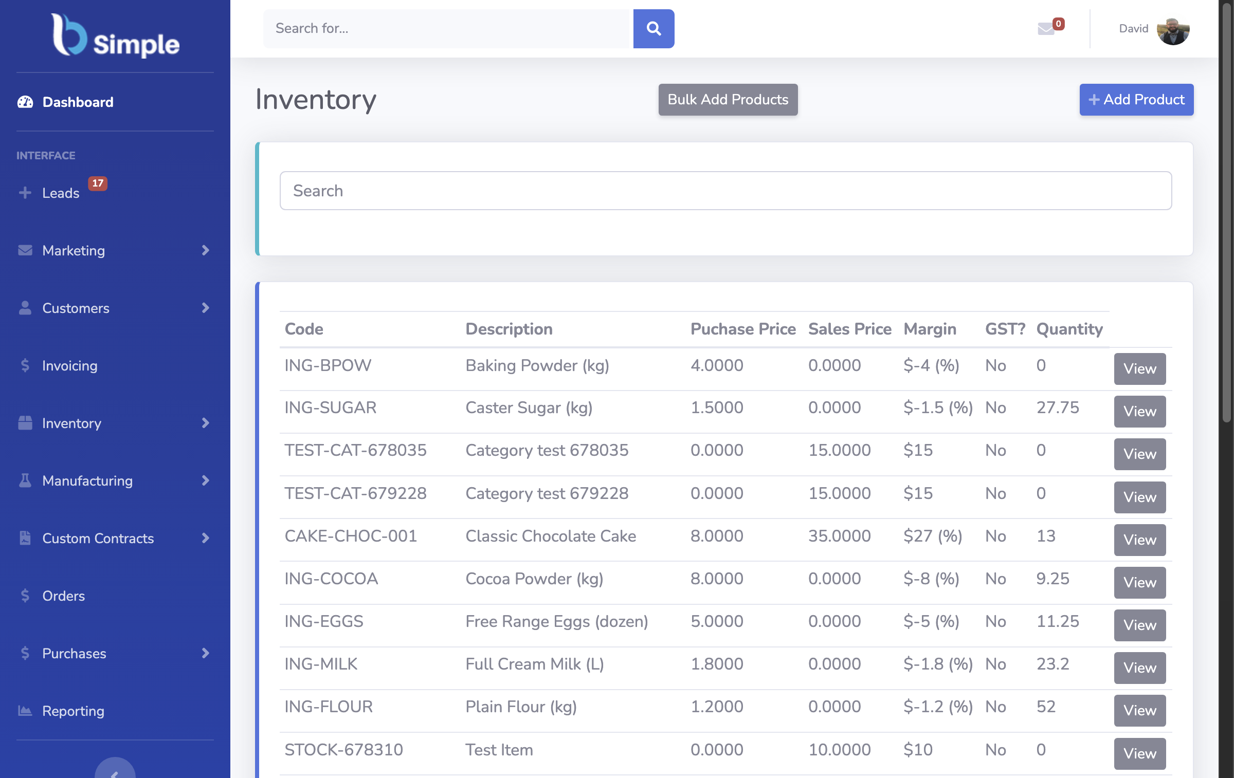
Density with discipline. The unit of work is the list: 40 products, 60 open orders, 12 pending receipts. The interface must show enough columns — SKU, quantity on hand, allocated, on order, location — that a person can scan and decide without opening every row. Consumer-grade whitespace is a defect here; the craft is density that stays readable.
State at a glance. Every order carries its stage — received, allocated, picked, invoiced, paid — and the list should carry it too, because the daily question is "what needs action now?", not "what is this order?". Colour and badges earn their place only when they map to state, never decoration.
Forms that prevent errors. The interface's highest-value job is refusing bad data: quantities that would oversell, movements without a reason, a receipt against no order. Guardrails belong in the form, before the save — the UI is where the record's rules meet the human.
Speed over glamour. Entry forms keyed hundreds of times a day need keyboard flow, sensible defaults, and instant confirmation. Every extra click is multiplied by the shift.
BSimple's interface, described honestly
BSimple is browser-based — any modern browser, desktop or mobile widths — organised around the record rather than around modules: orders and their states, live stock by location, purchasing signals, production runs and customer portals all read and write one ledger, so the numbers agree between screens because they are the same numbers. The interface aims at the operator's hour: lists that carry their state, forms that validate at entry, and approval steps that are deliberate rather than accidental.
What this page will not do is sell the UI with adjectives. Screenshots in a demo context tell you almost nothing about the interface that matters — which is how it feels on the two-hundredth keystroke of a receiving shift. The trial exists precisely because interface judgement is experiential: run one real hour — a receipt, an order, a count — and the UI question answers itself. The features overview maps what the screens cover.
Evaluating any operations UI
Run the list test. Can you find the three orders needing action in under ten seconds from login? Run the error test. Try to oversell the last unit — the form should refuse before save. Run the mobile test. A stocktake or a pick checked on a phone should be real work, not a stripped read-only view. Run the day test. An hour of genuine entry — not a guided demo — reveals the friction no screenshot shows. UI decisions are cheap to test and expensive to live with; the trial is the test.
Frequently Asked Questions
What makes a good business management system UI?
Readable density, state visible at list level, forms that refuse bad data before saving, and speed under repetitive entry. Consumer-style simplicity that hides operational columns makes the interface prettier and the work slower.
Is BSimple's UI web-based or does it need installation?
Web-based — BSimple runs in any modern browser on desktop and mobile widths, with nothing to install or maintain locally. The trial shows the interface on your own device and data.
Can the UI handle warehouse-floor use on mobile?
The browser interface works at mobile widths for checking stock and order state on the move; for scan-speed receiving and picking, the barcode layer pairs with standard scanners. Judge both in the trial against a real shift's work.
How does the UI show order status and stock state?
On the lists, not buried in detail pages: orders carry their stage — received through invoiced to paid — and stock lists carry on-hand, allocated and on-order per location, because the daily question is "what needs action", not "what is this record".
Where can I see real screens of the system?
This page and the features tour include genuine interface captures — but the honest evaluation is hands-on: the trial is the full product, and an hour of real entry outweighs any screenshot.

BSimple