
Guide / interface
Inventory management software UI
An inventory UI is judged at the two-hundredth keystroke of a receiving shift, not in the demo. What the interface needs to serve the work — readable density, visible state, forms that prevent errors — and how to test any UI, including ours, in an hour.
The key facts
- The three UI jobs: lists you can scan (density with discipline), state visible without clicking, and forms that refuse bad data before saving.
- The design enemy: consumer-style simplicity that hides operational columns — hiding allocated stock does not simplify work, it moves it into someone's memory.
- The BSimple approach: browser-based, organised around the record — orders carry their state, stock lists carry on-hand, allocated and on-order per location.
- The honest test: screenshots prove nothing; run one real hour of work in the trial and the UI judges itself.
- Where it fits: this page is one branch of the inventory management guide.
- 01The key facts
- 02Lists: the unit of work
- 03Forms: where errors are prevented
- 04BSimple's UI, described honestly
Lists: the unit of work
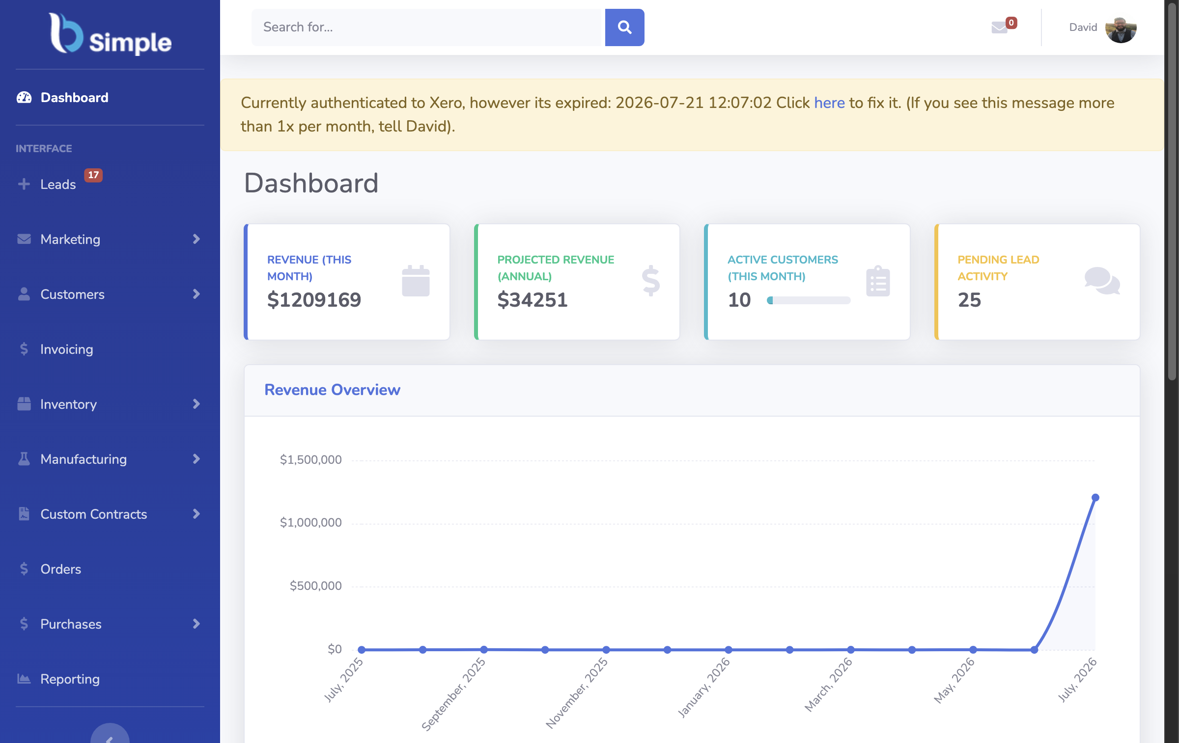
Inventory work happens in lists — forty products, sixty open orders, twelve pending receipts — so the interface's first job is density that stays readable. The columns that matter are operational: SKU, on-hand, allocated, on-order, location, reorder level. A UI that collapses those into a clean product card has optimised for the screenshot and against the operator, whose day is now opening rows to find what the list should have shown.
State belongs on the list too. Every order carries its stage — received, allocated, picked, invoiced, paid — and the list should show it, because the morning question is "what needs action?" not "what is this record?". Badges and colours earn their place only when they map to state; decoration that does not encode meaning is noise in the operator's peripheral vision. The dashboard question extends this from lists to the morning screen.
Forms: where errors are prevented
The UI's highest-value moments are the refusals: the quantity that would oversell the last unit, the movement missing its reason, the receipt against no order — stopped at entry, before the record learns the error. A form that accepts anything and apologises later is delegating quality control to the stocktake, which is the most expensive possible audit point.
Speed is the second form requirement. Receiving and picking forms are keyed hundreds of times a shift: keyboard flow, sensible defaults, and instant confirmation are not polish but the difference between an hour and an afternoon. The design principles behind these choices are worth reading before judging any interface against them.
BSimple's UI, described honestly
BSimple is browser-based — any modern browser, desktop or mobile widths, nothing to install — and its interface is organised around the record rather than modules: stock, orders, purchasing and production read and write one ledger, so numbers agree between screens because they are the same numbers. The lists carry their state, the forms validate at entry, and the approval steps — the deliberate moments where quantities commit — are designed to be noticed rather than clicked through.
What this page will not do is sell the interface with adjectives or pretend screenshots transfer. Interface judgement is experiential: the trial is the full product, and one genuine hour — a receipt, an order, a count — on your own products tells you more than this page, or any page, can. The features overview maps what the screens cover if you want the tour first.
Frequently Asked Questions
What makes a good inventory management UI?
Dense, scannable lists with state visible at a glance; forms that refuse bad data before saving; keyboard-speed workflows for repeated tasks. Consumer-style minimalism that hides operational columns works against the people using it hourly.
Is BSimple's UI available on mobile?
The browser interface works at mobile widths for checking stock and order state on the floor or off-site; scan-speed receiving and picking pair with standard barcode hardware. The trial shows both on your own devices.
How do I evaluate a UI quickly and fairly?
Run the hour test: receive a real delivery, pick a real order, correct one variance — timed, on your own data. Then the error test: try to oversell the last unit. An interface's truth is in its refusals and its repetition speed, not its screens.
Does the UI show who changed what?
The record carries actor, timestamp and reason on every movement, and the UI surfaces that history — because "who adjusted this?" is a daily question, and an interface without the answer is hiding the audit trail.
Is the UI customisable per user?
Permissions shape what each user sees and may do — the interface reflects the role, from floor scanning to back-office approvals. Test your roles directly in the trial rather than trusting a feature grid.

BSimple