
Guide / interface, judged
What to look for in a company management system UI
The interface is the software as far as your team is concerned. Here is what a good one does — screens that follow the workflow, a dashboard that tells the truth, actions that work on a phone.
The short answer
- The UI is judged at the worst moment: a delivery being received during rush, a count at 5pm Friday, a customer on the line.
- Good screens follow the document trail — order to pick to invoice — rather than making staff navigate between modules.
- The dashboard should answer three questions at a glance: what is ordered, what is invoiced, what is in stock.
- BSimple's UI is built around that trail — and a screenshot is worth more than this page: the free trial is the real demo.
- Where it fits: this page is one branch of the inventory management guide.
- 01The short answer
- 02The dashboard: three numbers, one glance
- 03The workflow screens: follow the document, not the module
- 04Where BSimple fits
The dashboard: three numbers, one glance
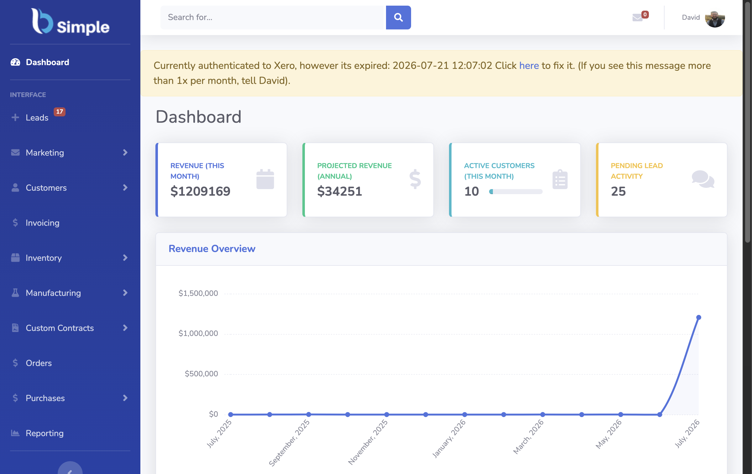
A company management system's landing screen has one job: tell whoever just opened it whether the business is where it should be. The honest version shows operational values — what is on order, what is invoiced and outstanding, what stock is worth — straight from the record, not from last night's report. If the dashboard needs configuring before it says anything true, it is decoration. BSimple's operations dashboard shows live order, invoice and stock values for exactly this reason, and the features page shows the screens instead of describing them at length.
The test to apply in any demo: change something — receive goods, pick an order — and see how long the dashboard takes to agree. Real-time records update instantly; synced ones tell you when the sync ran, which is a different answer to the same question.
The workflow screens: follow the document, not the module
The daily work of a product business runs along a document trail: an order becomes a pick, the pick becomes a pack, the pack becomes an invoice, the invoice becomes a payment status. A good UI keeps staff on that trail — each screen shows the document and its next action, with the record it acts on visible. A bad UI sorts screens by department module, so a picker opens three things to do one job, and every hand-off is a re-search.
Then the phone: receiving, counting and picking happen on the floor, not at a desk. A UI worth its name works in a browser on a phone — the same record, the same actions, thumb-sized. BSimple's stocktakes, receiving and scanning run from any phone browser for that reason; inventory software with a scanner shows what those screens do.
Where BSimple fits
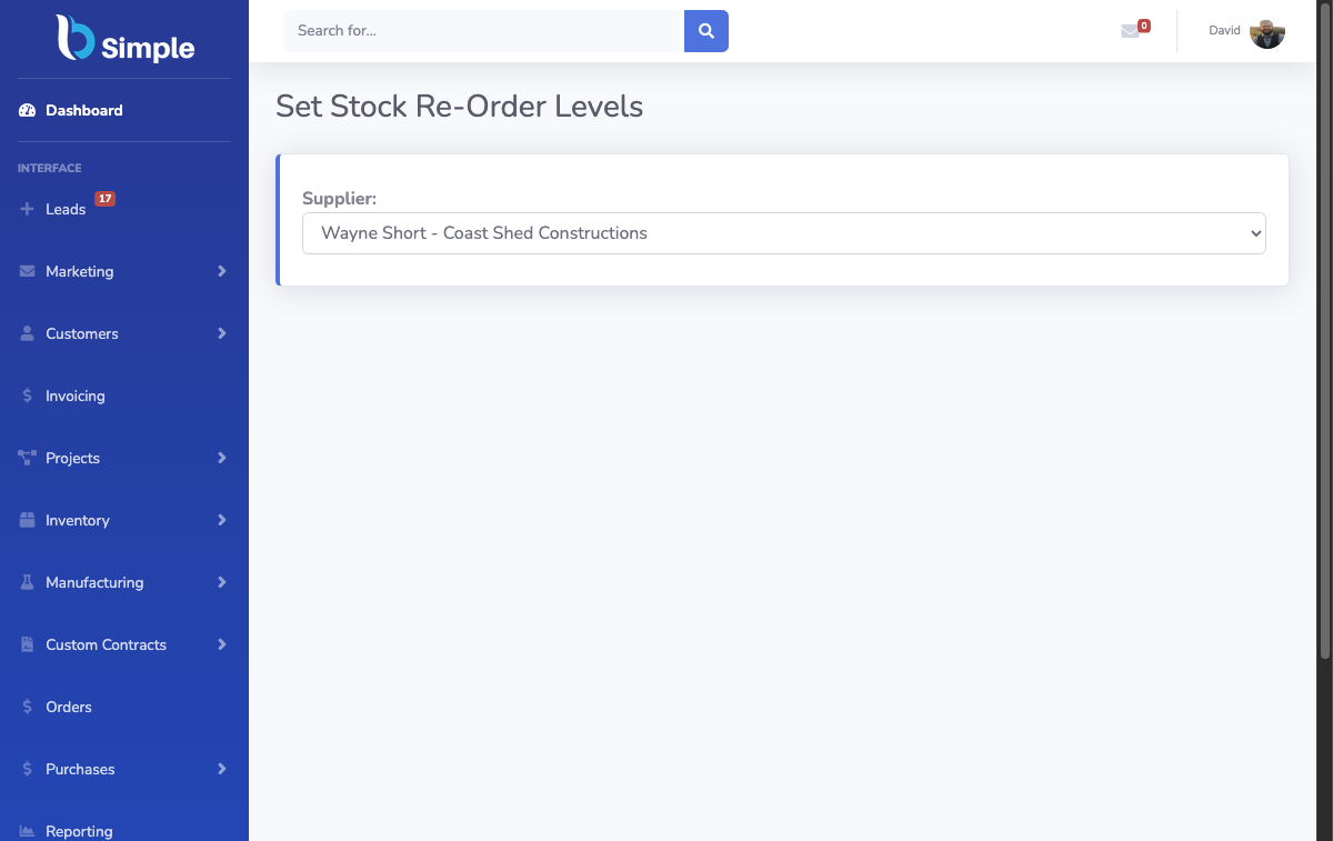
We build BSimple, so weigh that. Its interface is deliberately narrow: the document trail for stock, orders, purchasing and invoicing; the operations dashboard on top; batch tracing, reorder views and stocktakes one click from the record they act on. The design constraint was never visual novelty — it was that a warehouse hand and an office manager should both find the next action obvious without training. From $180/month (AUD), browser-based, nothing to install.
The honest caveat: UI is taste plus fit, and this page is our taste. Run the trial with your own products and let your team judge the screens by their worst moment, not a screenshot. The "best software" criteria includes support and fit tests that apply to interfaces as much as features.
Frequently Asked Questions
Is the BSimple UI good for non-technical staff?
That is the design constraint it was built under: screens follow the document a person is already working on, the next action is visible, and the floor jobs — receiving, picking, counting — run in a phone browser. The fairest test is giving the trial to the person who will actually use it, not the person choosing the software.
Does the UI work on phones and tablets?
Yes — browser-based, responsive, with the floor workflows (receiving, scanning, stocktakes, picking) designed for a phone screen. The office workflows read better on a larger screen, as they would anywhere. Nothing needs installing on either.
Can we customise the screens?
Within limits, and the limits are deliberate: reorder views, tags, segments and reporting views are configurable, but the document screens are standard. Deep per-user UI customisation is a feature of large ERP deployments with administrators — the trade-off BSimple makes is fewer settings against screens that work as they ship.
What should we test in the UI during a trial?
The worst moments: receive a delivery while the phone is ringing, run a count at closing time, answer "where is this order?" while the customer waits. If the interface survives those, the demo gloss does not matter; if it fails them, no screenshot redeems it.
BSimple